Backend Engineering At Popsa
Discover how we work as a backend team at the UK's fastest growing software company.
Read more
One of the achievements the Popsa team is most proud of this year is that we successfully launched personalised Calendars from a concept to landing on people’s doorsteps across 3 continents in just 3 months – all whilst working from home.
Back in August 2020 we had designed some blue sky concepts of what we wanted to achieve in terms of new physical products in the coming years, but it was only then that we made a last-minute decision to go for calendars by Christmas and therefore test our ability to deliver an industry-leading solution at high speed like never before.
Our ambition was to give customers the ability to make beautifully designed personalised calendars, free from the clip-art and chintz that have become ubiquitous and synonymous with this sector over the years.
Instead, we were inspired by mid-century modernist Swiss poster designs and in particular Massimo Vignelli’s famous Stendig calendar.
With a powerfully bold typeface and minimal page furniture, the Stendig removes all that is superfluous, leaving only the essentials.
Taking a similar minimalist approach, our prototype calendars showcased the customer’s photos - making them the stars of the show - and stripped back the traditional calendar grid to a limited set of visual guides.
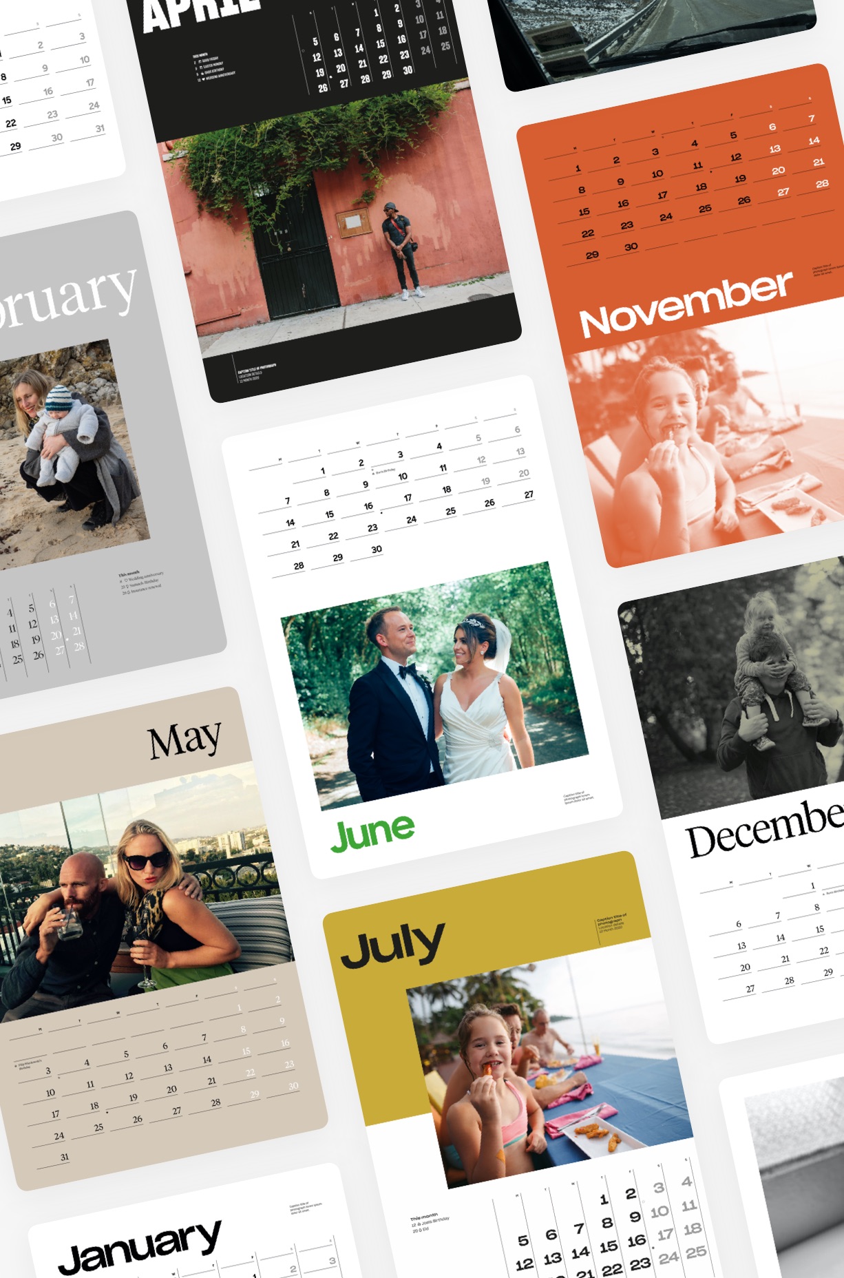
Importantly, we also set out to deliver this in an automated way, removing as many manual steps as possible in order to liberate our customers to immerse themselves in their photos and in rekindling their shared experiences after a turbulent year. After all, making the design process accessible to people from all walks of life is central to Popsa’s mission.
We had our challenge, but time was incredibly tight. There’s not much point in launching a calendar product in March when no one is interested; we had to finish everything by our ‘peak period’ in mid-November - just in time for customers to order them as Christmas gifts. We had given ourselves 13 weeks.
There are three critical things that I learnt during my 10 years as a Product Owner when it comes to maximising value in a short space of time:
Firstly, when embarking on a new product, don’t look at what your competitors are doing. This is particularly dangerous when your USP is user experience.
It can be so tempting to take a shortcut to save time - to inherit someone else’s learning - but more often than not you end up importing their mistakes instead. Wherever possible, start from first principles and what you know about your own customers.
We did not study any established examples of user experiences for designing calendars. Instead we looked at what had made our Photobook creation experience so popular – how our customers were describing it relative to other products in the market in their own words.
We concluded that we had to build a UX that took away “faff” and “frustration”. People weren’t looking for the cheapest, nor something with the most features, they wanted a creation process that did not get in the way of the emotional connection they felt towards their photos and the people in them.
We needed to show our customers value as soon as possible, do most of the heavy-lifting, but then ensure that they could transform their creation in any direction within two taps.
We wanted to give our customers real control of their creation by allowing them to mould and adapt without cognitive overhead.
• • •
Secondly, design with passive provision in mind.
When civil engineers are designing tunnels, such as those for Crossrail or HS2, they’ll occasionally plan tunnel ‘stubs’ that will allow for easy future expansion without having to suspend service on the main part of the new line. Without these pre-planned branching off points - passive provision - it is often too difficult or prohibitively expensive to come back later and add something to the network.
This problem can also occur when building digital products at scale. Too often an API, data model or user interface is designed with only the short term objective in mind which means it’s really hard to branch off when building new functionality in the future, without causing some kind of backwards compatibility problem or triggering a large-scale redesign.
Judging how much time (and thus money) to put into something that might not ever happen is as much an art as it is a science but you can achieve an awful lot by thinking in abstract terms and facing up to any complexity early on as thought experiments, rather than leaving it to chance.
We did exactly this with Photobooks in 2019 and the pay off was our rapid development of Calendars in 2020.
For the first 3 years of Popsa’s life we had resisted introducing the ability to add captions under your photos – in fact any text at all – until we had the time to focus on it.
Having no captions might seem insane, but we had huge year-on-year growth for 3 consecutive years without any ability for users to add any kind of text. Better to have a simple product that works seamlessly than a fully featured product that’s a nightmare to use.
We could have added some sort of primitive text ability at any point but the problem with moving fast and breaking things is that you’re often left maintaining lots of disparate areas of functionality that are incompatible with each other.
Our restraint meant that when we came to add this feature to our range of photobooks we were able to come up with an incredibly flexible system that adapts to many scenarios.
Text might seem like a trivial thing but it’s actually one of the trickiest areas of design engineering because every operating system renders text differently. This is a problem if you are designing on one platform and re-creating that design as a print-file on another one, like we do at Popsa.
Before even thinking about how a user might add a caption to their photobook, we spent September 2019 going back to the fundamentals of typography and prototyping the representation of attributes such as letter-spacing, line-height, rotation, and alignment across 3 different platforms and painstakingly adjusted each of them until they matched.
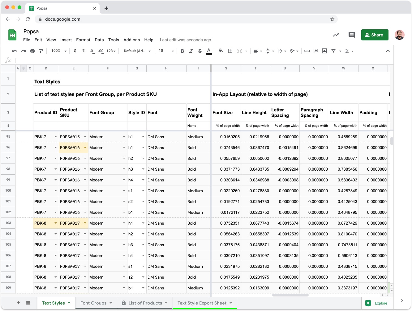
On top of this we invented a method (shown above) of easily adjusting these properties on a product by product basis (so that extra large books would not have giant text), and another method for allowing our product designers to describe the text-properties available to users inside a template, thereby obviating the need to write code.
We subsequently combined all of this into a system whereby you could swap out any template for another one whilst preserving the captions, and you could change the type of product at the checkout and all of your captions would seamlessly reflow without you having to check them, whatever font or text size you had chosen. You could even personalise the placement and alignment with a single of tap, without having to fiddle around on a small screen.
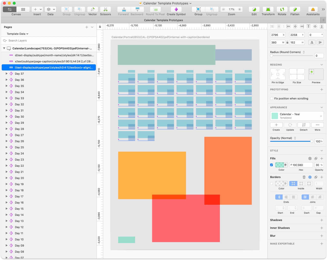
However, the best bit is that this system was designed to be leveraged by future products, and for Calendars we did exactly that.
When you set aside the photos, a calendar is essentially a series of text ‘elements’ arranged in a very specific order.
We took our captions system, created a read-only mode, and augmented each element with some metadata to effectively assign it a different purpose. For example, some elements were set to respond as a month-name, others as day-numbers, day-names or years. Elements that represented the days of the month were given sequence numbers to ensure that the days would be in the correct order, irrespective of what year or month the template was set to.
Meanwhile we assigned a ‘sequence mode’ to the overall template. This was particularly important as it set the foundations for allowing users to choose between ‘poster’, ‘list’ and ‘classic’ style templates – the difference between a piece of artwork on your wall, or something much more functional and our own take on the traditional grid format.
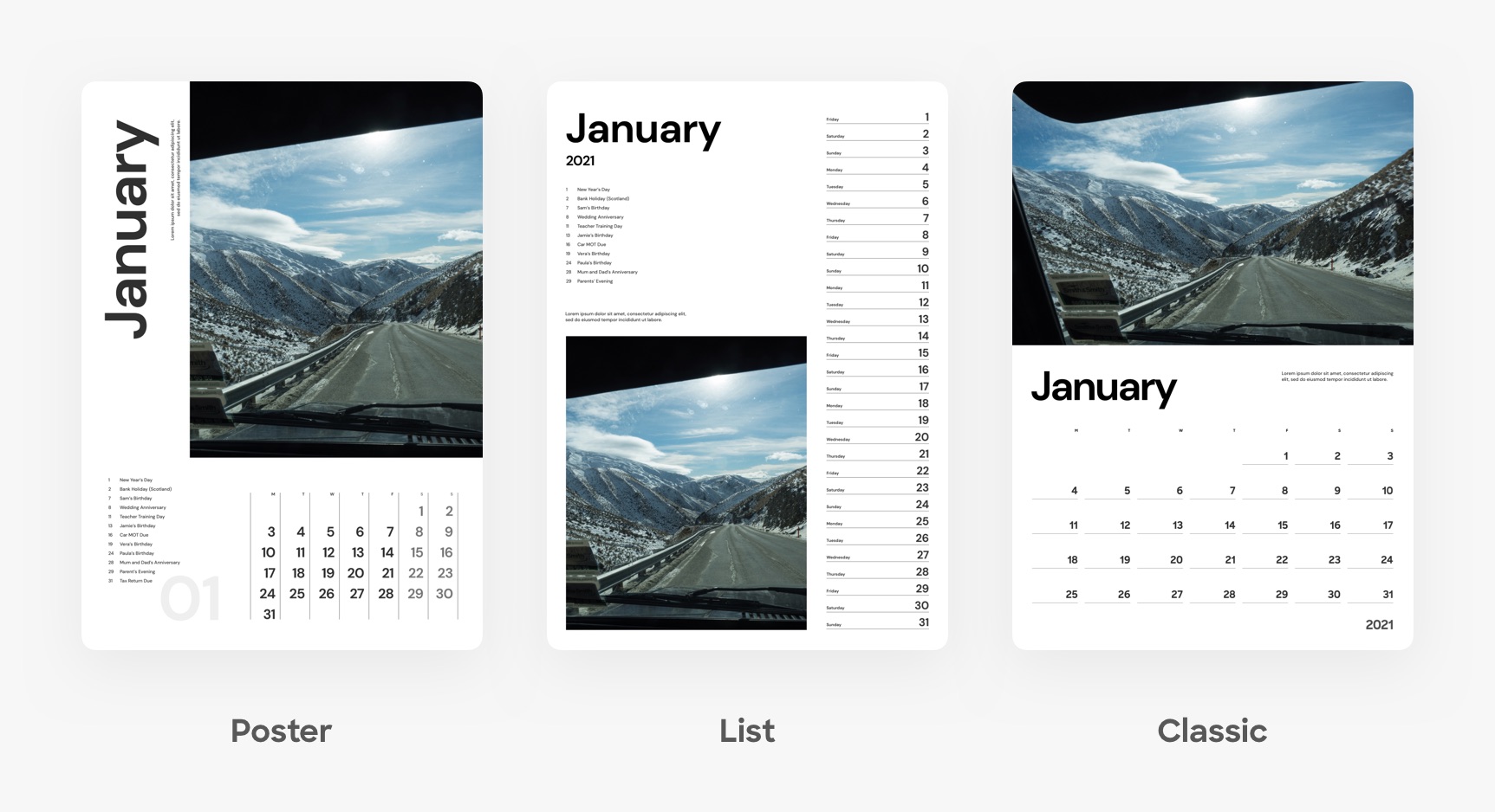
Each mode triggers a different bit of temporal logic depending on the user preference. For example, grid formats require dates to be dynamically offset from the first element in the grid depending on the day of the week the month starts on.
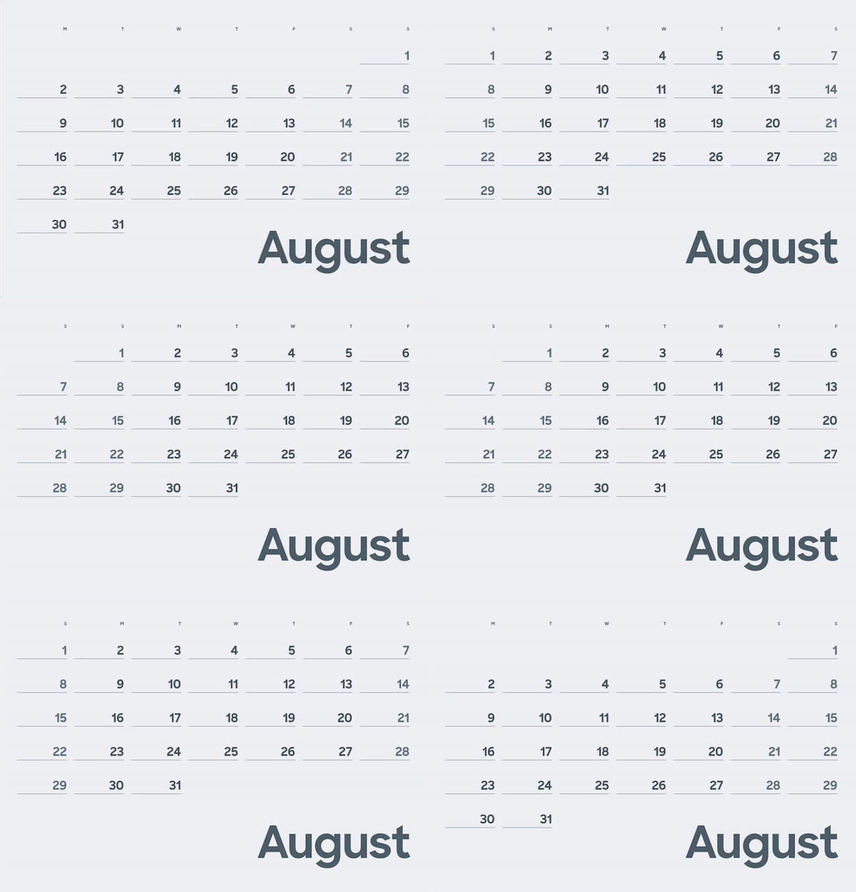
These metadata properties combined with the flexibility of our caption system allowed us to set up hundreds of templates across 4 different sizes and 2 different formats of calendar in a matter of a few weeks.
And when it came to testing them in our app for the first time, it all just worked. It was an amazing moment.
Several bits of technology had come together seamlessly and in record time thanks to passive provision.
• • •
Thirdly, one of the greatest challenges when developing products is to ruthlessly prioritise what is actually key to achieving your primary objective, and de-prioritise everything else, no matter how common sense those things might seem.
This is really important in ensuring that when you approach your target launch date you have completed 100% of something good, rather than 50% of something excellent.
We started with a blank canvas. There were so many exciting things that we could do but there were also so many preconceptions about what a calendar needs to show.
Over the years I’ve learnt the hard way that self-discipline is rewarded in product development. If you get the foundations right, you’ll be able to innovate so much faster in future because you can leverage your work instead of rebuilding it. This is how you decide what to build now and what to stub as passive provision for the future.
With this in mind, we took another big decision that we hoped would pay off in the future. Mirroring our bet to hold off on captions in photobooks, we challenged our initial assumption that customers would be put off purchasing if they couldn’t include public holidays such as Christmas Day or add private events such as birthdays.
Instead of rushing this feature out, we decided to play it long and leverage this work in other areas in the future – such as in a birthday reminders feature, automatic event detection (can we detect if you’re interested in Christmas from your photos?) and also for suggesting titles for photobooks. “Our Walk in London on New Year’s Day” is a much more emotive title than “1 January 2021”.
You’ll start to see fruits of this longer-term bet emerge in different parts of the Popsa platform over the coming months and come next Christmas we’ll have an ecosystem of functionality in this area; data from different features along the user journey populating your 2022 calendar, just like magic.
This kind of decision making – strategically placing short term bets for immediate impact, long term bets to speed up future innovation, and then implementing them in the right order – has been critical to our success.
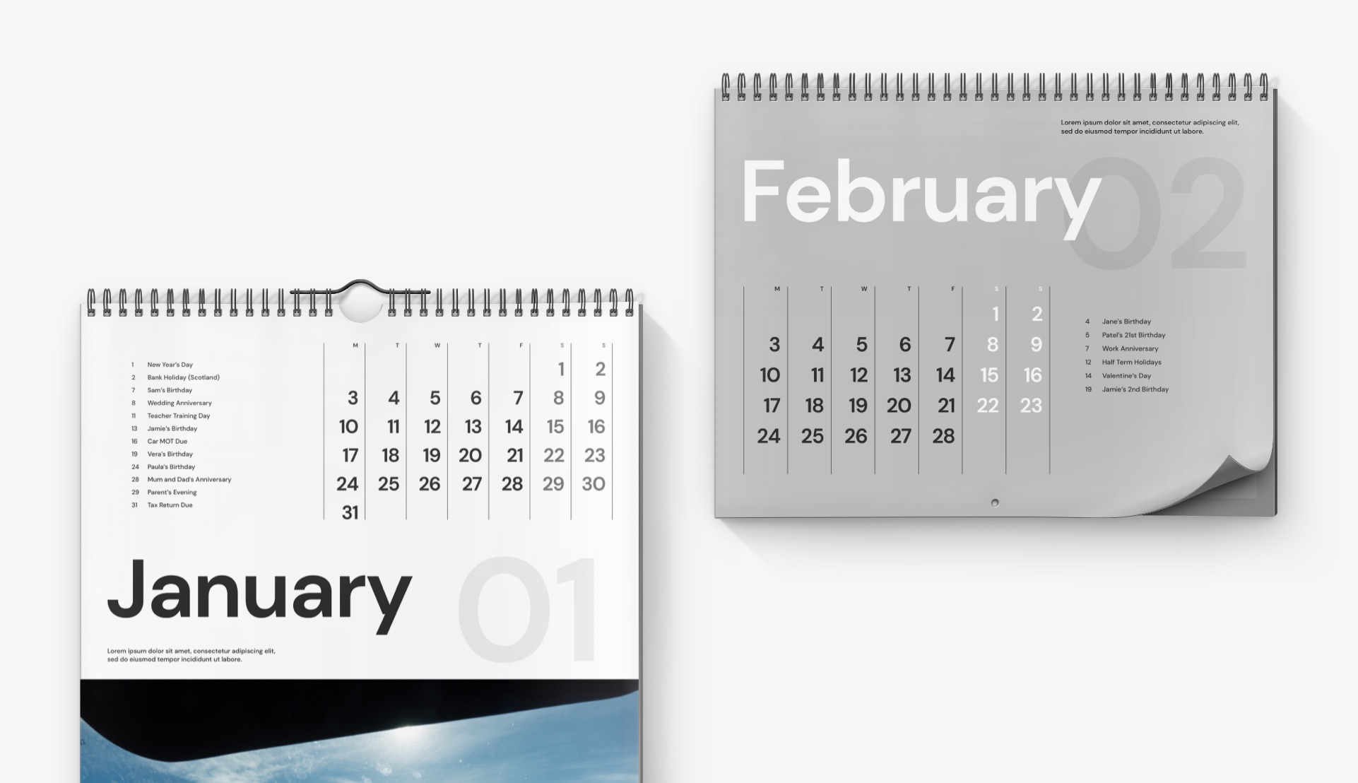
Unusually for a startup, we set ourselves up as an international business from day one. Although we are headquartered in London, only 18% of our revenue came from British customers in 2020.
Localisation for 50 countries in 12 languages was therefore top of mind when developing our calendar product – we had to devise a system that would work in each of our markets.
The first day of the week is not internationally agreed upon. Americans start on Sundays and Europeans tend to start on Mondays – except if you’re Portuguese. Most of North Africa start the week on a Saturday and the Maldives start with Friday.
We colour the weekends differently so it was also important to recognise that some countries consider weekends to be Friday and Saturday.
We also had to make sure we were displaying the correct translation for days of the week and months of the year. Did you know that in Polish and Finnish a different word is used for January when standing alone compared to when used in a sentence? Thanks to the Android customers who helped us with that one!
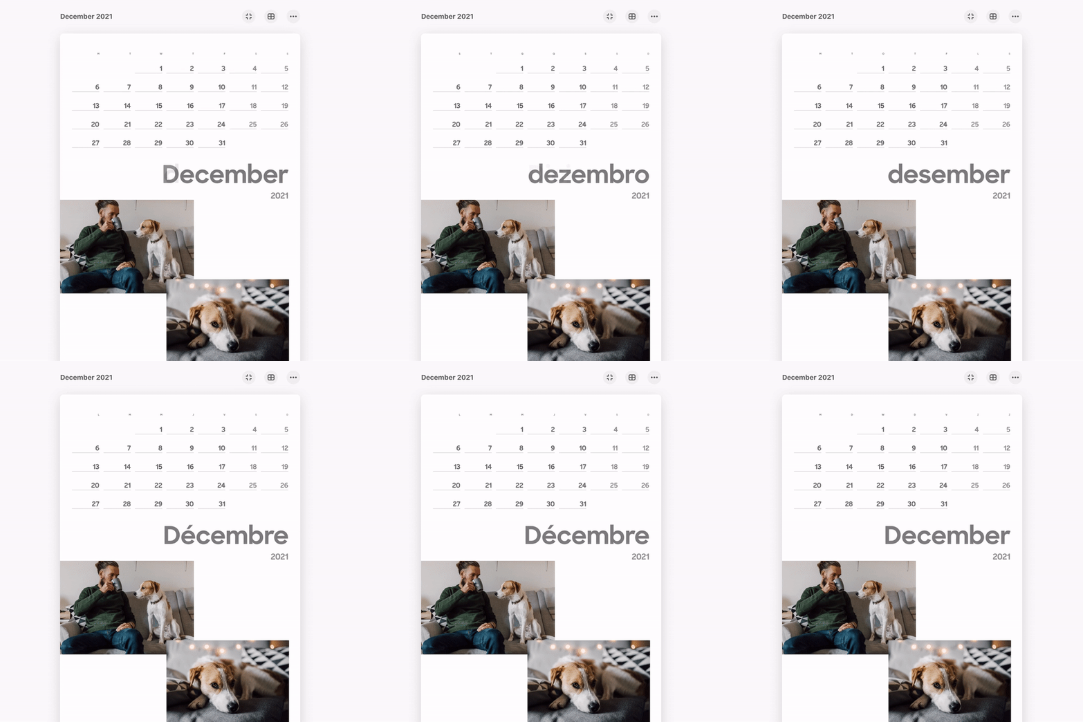
Defaults for everything were to be inferred from the user’s locale and IP so that the vast majority of people should feel like they are dealing with a local company, and for those gifting across borders these regional variables were exposed in the form of a Calendar Settings feature, allowing them to change their region and reflow their entire design in the blink of an eye.
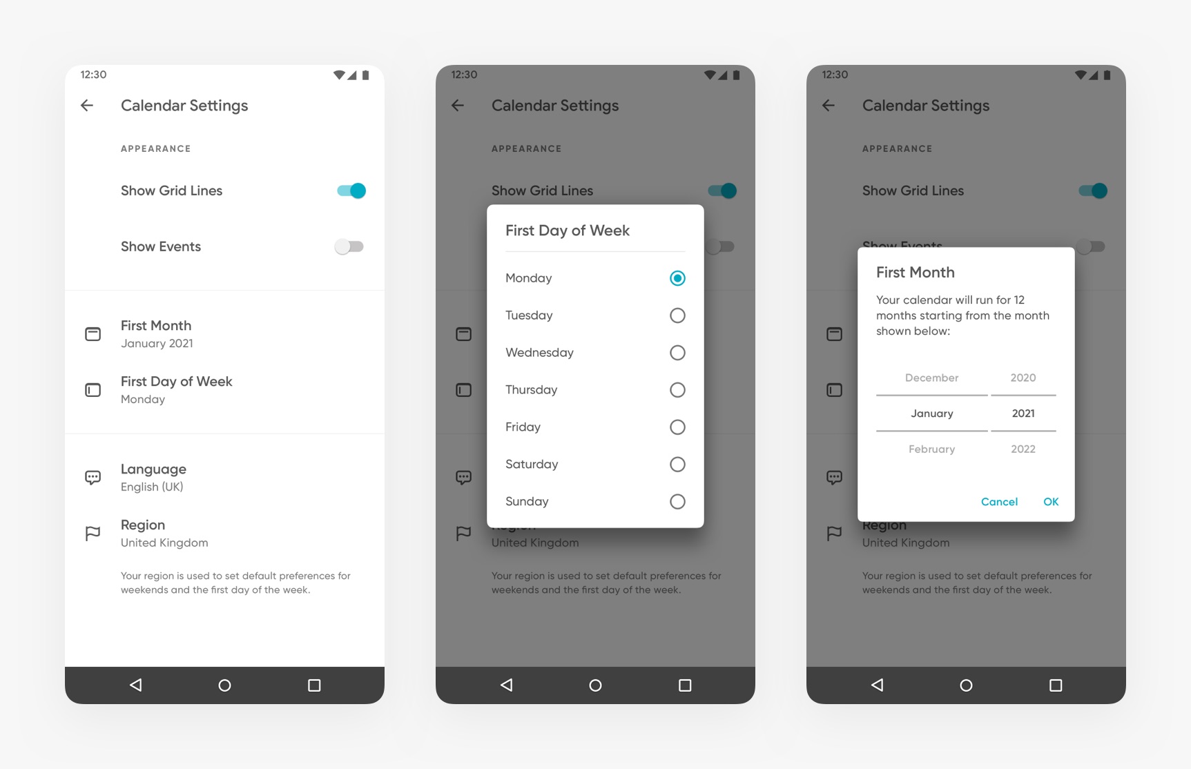
At this juncture we were able to look ahead and build in passive provision for our upcoming events functionality. As a result, we’ll soon be able to cater for everything from Bastille Day in France and Mother’s Day in Belgium to Burns Night in Scotland. Customers should see only the holidays that are relevant to them. You shouldn’t see Thanksgiving if you live in Norway.
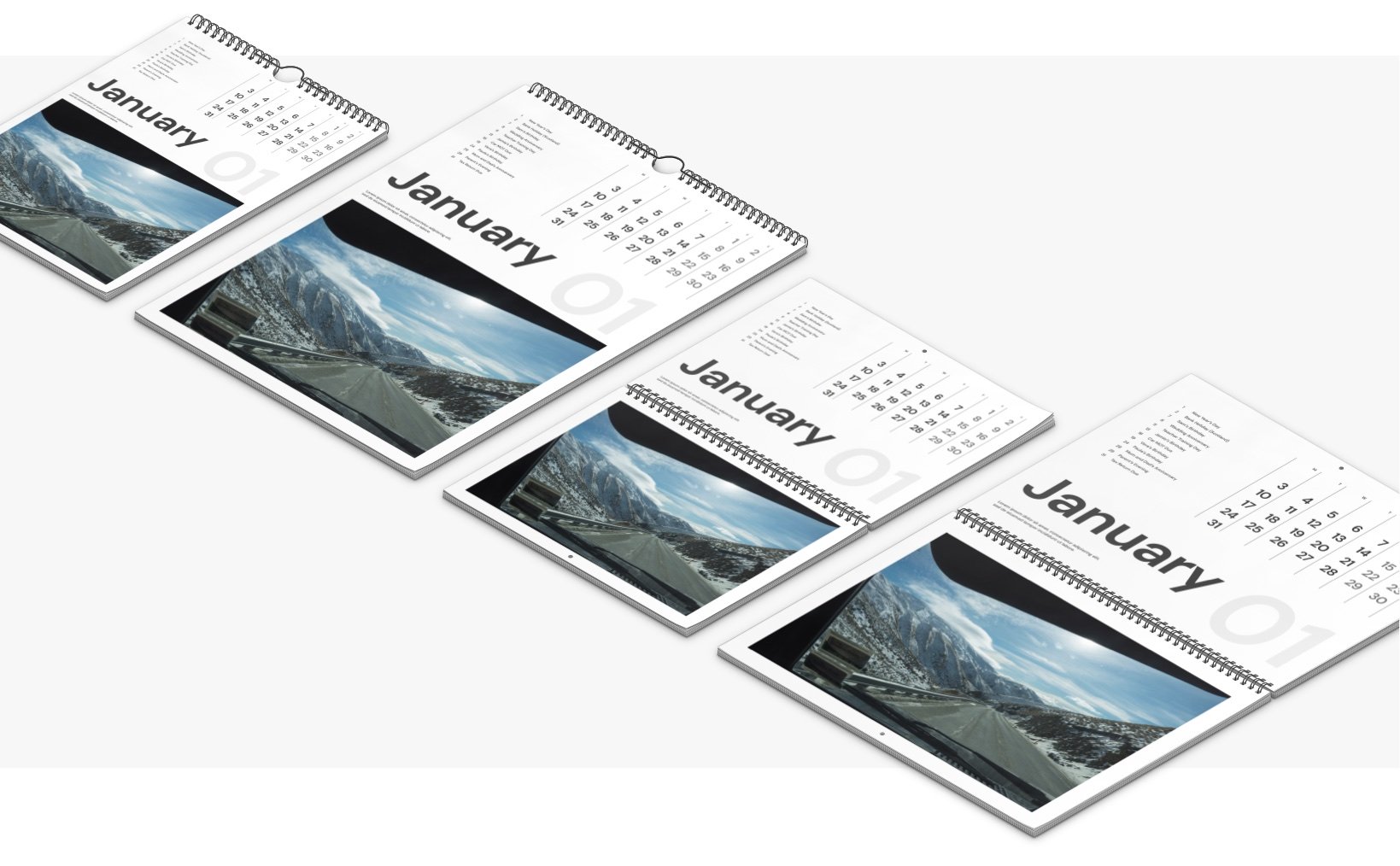
And if all that wasn’t complicated enough, our printers in the U.S. and Australia did not have the tooling to produce our poster-style portrait calendars. So we came up with a separate range of templates in a central-bound landscape format especially for those markets.
When moving fast it’s almost inevitable that you’ll build up technical debt. But too much of it can make future iteration painful and slow.
Knowing what to let slide and what to refactor – and when – is a difficult judgement.
We generally prioritise paying off debt that is affecting the stability of our platform but other than that we are opportunistic. i.e. We only rewrite functionality that will otherwise significantly slow down our rate of development on upcoming features that we believe to be high impact.
During our work on calendars we solved one historic piece of debt and created another one. Both of these helped us go faster.
Every time a customer places an order we recreate their local design on our remote platform from its constituent parts (photos, text, themes and so on) rather than transferring the entire print-ready document from the device. This means that we only transfer high resolution images once per design even if you order it several times. It also brings a huge advantage in that whenever we need to update a theme or template, we can do it remotely and update every instance of a design that uses them in the wild.
The downside is that we need to perfectly recreate what users see in our apps also in the cloud where we use different operating systems and programming languages. We call this backend representation technology “the renderer”.
The renderer was one of the first things we built at Popsa and it was showing its age. In fact it was the only component in our platform that used a different programming language. So we rewrote the entire thing in a language called Go so that more of the team could contribute to it. It sped up the introduction of Calendars by an order of magnitude and removed the last bit of Popsa 1.0 still in use.
Meanwhile the introduction of new calendar templates had ballooned the ‘catalog’ – technical descriptions for all the upgrades, design options and prices for each product – that we sync with our apps. There is so much data on a calendar page compared to the pages of other products that we hit a previously unknown memory limit when decoding them. It was an innocent but unscalable architecture that was built in simpler times.
With time tight, we implemented a temporary solution that allowed us to decode the new templates despite also knowing that it wouldn’t scale, and then added it to the Q1 to-do list.
Some debts are worth taking on.
When developing a new product, no matter how much research you do, there’s always something about the way people use your product that you don’t easily foresee.
Back when prototyping our calendar designs we had made an assumption that there would only be a need for one photo per page. A bit like the Countryfile calendar you might buy for your Grandmother – one stunning photo that represents that month. Everyone we showed it to loved the designs, so we implemented it just like that.
A few days until November and everything was coming together. The app worked spectacularly well, our platform team had delivered in record time, the templates looked great and dates loaded instantly, but it didn’t feel right.
The selection of photos felt incredibly rigid. This was in danger of becoming a source of frustration we had seeked to avoid.
What if I had more than 12 photos? How do I decide? How can I make sure that I do not select two from December leaving nothing for November?
A quick answer to these questions was not automatic photo selection experience (a much longer-term challenge that we’re training machine learning models for). The solution was to remove the anxiety completely and allow the user to select many more photos instead. Those difficult decisions should not need to be made by our customers.
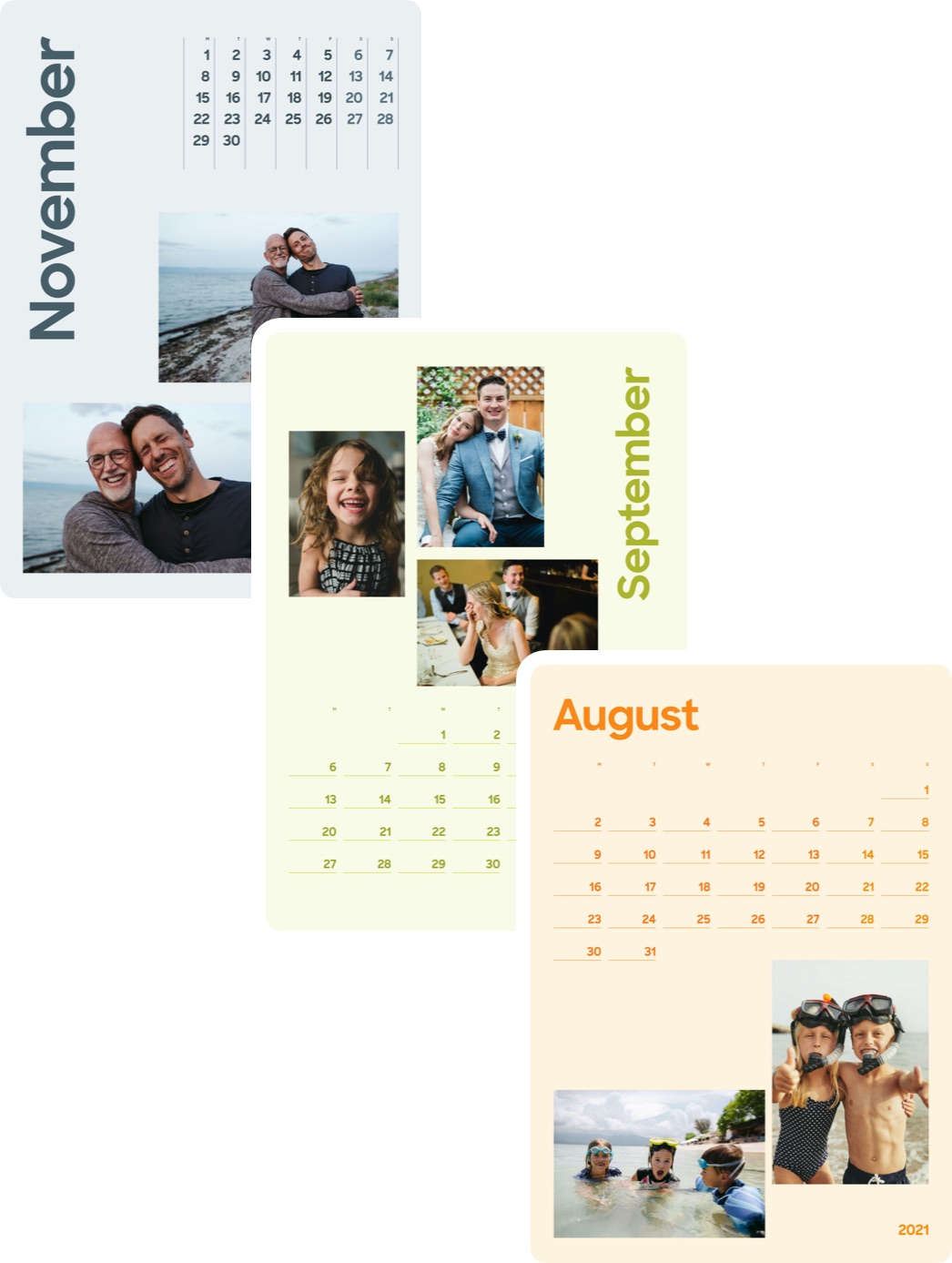
The knock on effect of this was that we needed to design triple the number of templates in a matter of days to take many more photos that originally envisaged, without compromising the minimalist aesthetic.
A fortnight of late nights awaited us just as England’s second lockdown began.
Templates weren’t the answer alone. The more templates you have, the more decisions you push further down the user journey.
Our customers have ordered millions of photobooks over the last 4 years and a lot of that success is down to a suite of custom algorithms we created to automatically generate the best layout given a selection of photos. These are collectively known as PrintAI.
Each algorithm is responsible for a different thing. One process organises photos in such a way that they tell a story, a different one matches the photos with others that have appropriate aspect ratios in order to create a collage, another model detects the salient areas of photos to make sure the focal point is not cropped out.
Now that we had to deal with multiple photos per month we decided to extend PrintAI and introduce more temporal concepts, specifically so that it could work out which photos should be assigned to each month, when to create a collage, and what to do with months for which there was no photo selected.
In addition, these algorithms kick into action every time users change templates (to match photos from the old templates to spaces in the new one whilst preserving as many user-made edits as possible), and every time they drag photos around from one space to another (to ensure nothing important is automatically cropped out).
Speed is paramount in our user experience. We set ourselves the challenge of creating the initial document whilst completely offline within 500 milliseconds to avoid user drop off, and reactions to edits must happen within 100 milliseconds so that each photo has been repositioned before the animation finishes so that photos do not appear to jump around the page.
The last-minute change was worth it. The UX was transformed. Users could select their favourite photos and Popsa could match them up with the correct months within seconds.
Just two weeks after launch, 50% of users who triggered the PrintAI algorithms went on to purchase their calendar.
The ability to recognise flawed assumptions and turn on a sixpence just days before launch is integral to who we are as a company.
This nimbleness should not be taken for granted; we are going to need to actively work on maintaining agility as we scale. But the best thing is, everyone is up for it. The thrill of launching something that works is addictive.
The pièce de résistance arrived just in time for launch day.
In my view, the best products excel at reducing people’s anxiety and that is particularly true in our sector where customers cannot touch or see the end product before they purchase.
Throughout 2020 we have been developing a series of bespoke 3D experiences to tackle this problem. Through skill and iteration we’ve managed to recreate our product range in exquisite detail as virtual models that don’t exist to be viewed, but to be interacted with.
Popsa customers can now effortlessly flick the pages of their Photobooks, shuffle through their Prints like a deck of cards, and see stunning refractions in their glass Christmas Ornaments as they swing and twist into view.
For Calendars we studied the physical mechanisms in great detail, faithfully recreating the ring binding, hanging bar, shadows against the wall and a sense of gravity as each page falls.
Our work, aimed primarily at surprising and delighting our customers, has also had a very real commercial impact.
Conversion of iOS users from the selection of photos to a purchase has increased on average by 7% for those using this feature compared to those who don’t. In addition, that higher number of converting users each spend an average of $4 more per order, compared to those who purchase without previewing their creation in 3D.
It’s safe to say that we will be developing this feature on Android in 2021.
Popsa released personalised calendars to the public on the 15th of November - right on target.
We sold 10,000 of them in the first 10 days. We passed the $1m milestone within 4 weeks.
And as we head into 2021, tens of thousands of our calendars are still being dispatched from production sites in the UK, Czechia, Australia and the United States to happy customers around the world.
After more than 10 years in the role of Product Owner in several successful startups, it’s now time for me to finally relinquish this role so that I can fully concentrate on my duties as CEO as we scale towards our next goal of $100million.
This year will see us forming a new product design studio and a much expanded platform team to help us meet even bigger objectives in the future.
If you'd like to invent new products – just like these Calendars – from scratch, please do get in touch, we'd love to hear from you.