Growth Hack: How we boosted App Store conversion by 400%
Sometimes it's the small changes that can have the greatest impact. But discovering hidden bottlenecks is harder than you think.
Read more
Customer experience is hugely important to the whole team here at Popsa. It's what sets us apart.
The well-known companies in the personalisation market all have something in common. They treat photobooks, prints, postcards and posters as commodities; sold like any other item you might find in the Argos catalogue.
We think this is wrong.
These days your photos are the story of your life. We just help you tell it.
This belief is shaping how we design the next generation of our products.
The problem with personalised products is that there are countless possibilities along the way to a product you can be proud of. Helping you tell your story means reducing unnecessary complexity and guiding you to your desired outcome rather than just offering hundreds of options.
The only way to achieve this is to predict behaviour.
When we generate a photobook layout for you, it is based on hundreds of calculations which have been designed to mimic decisions you might make yourself if you had to do it manually.
We don't always get it right, but we're getting better at it and not just by chance. We program our algorithms by analysing the editorial decisions of our customers.
Popsa works with Mixpanel to securely analyse patterns of behaviour across a population of app users. No one's photos are viewed, but we do analyse the number of adjustments people make to the crop position or how many times the colour scheme is changed, for example.
Other analytic patterns allowed us to spot that customers were accidentally trying to used old credit cards that had expired. Simply adding the expiry date to the graphic representing the card vastly reduced this problem.
It can also help you spot unintentional side effects...
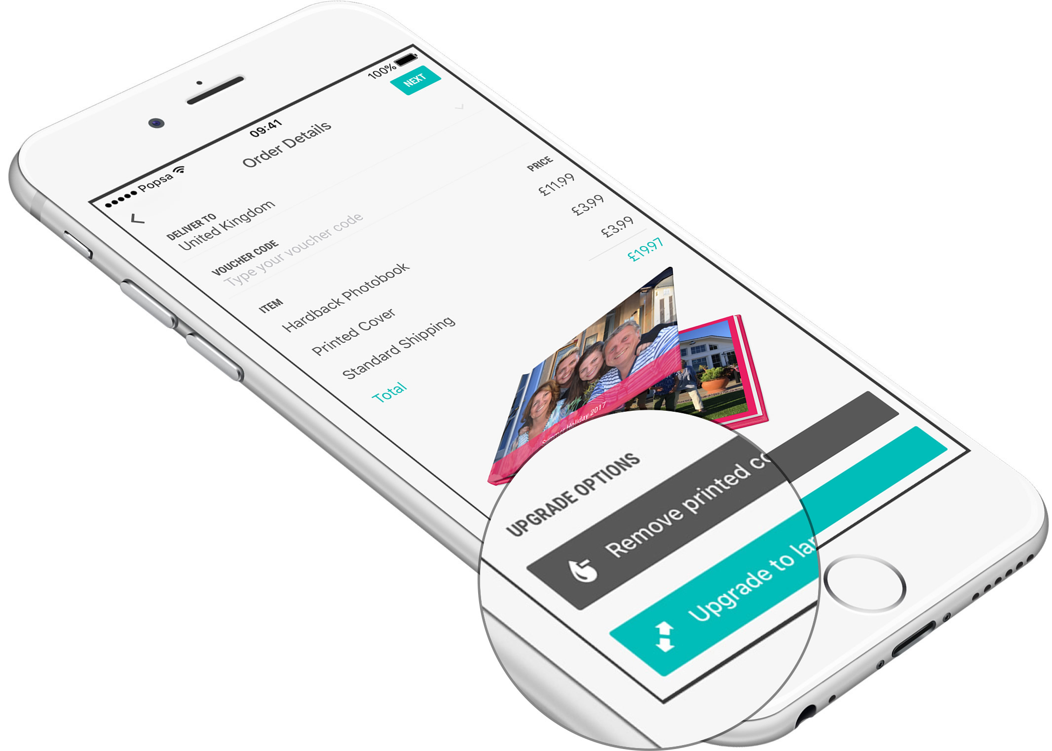
When we first added the ability to upgrade to larger products on the 'Order Details' page people started to use the feature but then it's usage dramatically fell. The reason turned out to be that our customers were getting anxious about tapping the button to upgrade (to see what their book looked like with a hardback cover) specifically because they then could not easily switch back to the original product.

Adding a 'downgrade' button sounds like it would reduce the number of upgrades but in reality it had the opposite effect. More people now upgrade because they know they can easily downgrade again should they need to.
Additionally, our analytics system automatically alerts us to customers who need a helping hand because they've not found a feature. Confused customers is neither good for us, nor them, so every little thing we can do to help out makes for a better Popsa experience.

One such feature that people aren't finding as soon as we'd like is Drag-to-Swap. This is because it requires a long-tap gesture to activate which isn't immediately obvious. Our data has not only shown that this is a potential discoverability problem, but also that users who have found it are more likely to make an order by a significant margin of 15%.
Look out for some changes in this area by the end of the Summer.
When you understand how your customers make decisions you can help them in a much more effective way.
We are now embarking upon a full design review of our products in response to the data we are seeing every day. Our customers have started forming a particular habit which we'll be fully embracing and encouraging in Version 3.
If you're a Popsa user we'd like to hear from you! Tell us about your experience and we'll send you a discount for your efforts. Send an email to feedback@popsa.com and help shape the next generation of our app.